xpert
diy her?! i hardly knew her!

The problem
Develop a digital platform to help connect millennial renters and homeowners to local home service professionals.
My Responsibilities
Though it was a team effort, there were somethings I worked independently on, or played a larger role in their execution.
Project management
Survey creation & data synthesis
Wireframe kit & style guide
DIY concept screens & prototype
Usability plan & report
Prototype Links
Medium
iOs App
Tools
Whiteboard
Miro
Sketch
InVision
Zoom
Quicktime
Assumptions
In the brief, our stakeholder made a number of assumptions that we needed to test and validate:
Our ideal audience is millennials (23-38 years old) and lack DIY knowhow
They prefer a cashless experience and trust ratings and reviews
They want to connect with other users
Our target audience equally values convenience and value-for-their-money
Contents


RESEARCH
Competitive analysis
Domain research
User interviews
Survey (view)
You know what they say about ass…u…ming
We had the suspicion that millennials were not as averse to DIY-ing or as incapable as our stakeholder believed. In our research plan, we made sure to include touchpoints for all the assumptions we identified in our brief.
We dove deep into the home services sector through competitive analysis and domain research. Equally important to the equation was discovering user’s habits when it came specifically to servicing their home, and how they engage with on-demand services more generally.

Our cumulative research revealed an interesting opportunity for our stakeholder to double their audience by simultaneously appealing to the DIY market.
Synthesis
Problem statement
Affinity diagrams
Personas
Use cases
Dooon’t stop! Find meeeeeeeaning!
Hold on to user’s feeeeeeelin-iii-ingggs!
Yikes. I concede the fact that was a stretch of the predominantly-white-frathouse-at-2am-any-given-night variety but it will make more sense relatively soon, I promise!
Once we had a lay of the land, we defined our user’s problem. We took our insights from the research phase and made multiple affinity diagrams as a way to synthesize our research and uncover insights from our users.
We took our insights and used a number of design tools to empathize with our users. We crafted personas, use cases and journey maps (Journey… maps. JOURNEY maps. Get it?? Journey??? I told you it’d get better!). The sum of these parts informed our design principles, and like NPR, we had AllThingsConsidered. We had our problem.
I was personally responsible for the copy and creation of our two journey maps.
Lauren’s journey (click to expand)
Ideation
6-8-5 Sketching
Divergent concepts
Concept prototypes (Invision)

DIY concept prototype (click for InVision)
diy her? I hardly knew her!
We grasped the problem space for our users. So what was next? The ideation process, of course!
We started ideation to work towards developing solutions for our user’s now-defined problem. We brainstormed, took the best of that and then mind mapped. Then we 6-8-5’d three distinct concepts - I was responsible for concepting the DIY section of the iOS app.
DIY concept 6-8-5 (click to enlarge)
The DIY Projects screens alongside a Tools + Materials knowledge-base hoped to answer a few of our user’s frustrations:
Though the great majority of our users had an interest in DIYing, some didn’t feel confident in trying projects because they lacked the necessary knowledge.
Users who do attempt DIY were overwhelmed by the sheer amount of online resources (where 91% of users found DIY info). It took too long to find a relevant and reliable DIY resource.
convergence
Wireframe kit
Wireframe kit - symbols (click to enlarge)
Once we had an idea of how it would all fit together, we developed and converged our concepts into a mid-fidelity prototype to bring to our users. Because of the tight timeline, we had to skip concept testing and move straight into usability testing with an understanding that cuts would be made to our final product.
We structured our usability test to test individual concepts as well as general usability to see what worked and what didn’t (raw data table below). We found that the app #didtoomuch, leading our users to experience some confusion regarding it’s overall purpose.
you’re doing **THE Most** rn
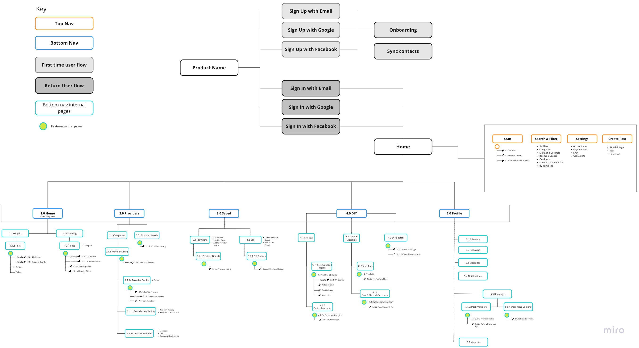
When it comes to the convergence process, I find one of the most helpful instruments in aligning and structuring a product’s component parts is the site/app map (view here).
Another extremely valuable tactic for meaningful convergence is the creation and subsequent utilizing a team-wide wireframe kit & library. I take a significant amount of pride in the level of organization of kits I’m responsible for, such as the one below:
Wireframe kit - guide (click to enlarge)
What?? The UX is confusing!? That’s not why we’re here! Click here to view all raw usability data.
Iteration
Cumulative research affinity map (below)
Iterated problem statement
Iterated design principles
Iterated wireframes
To quote the irreverent N*SYNC…
Bye, bye, bye… BYE BYE!
We came to the conclusion that a whole section of the app needed to go. Which one you ask? I revisited our initial research and pulled our key takeaways. I applied the new lens of our usability test results to our prior research by affinity mapping it all!
I uncovered there was no data to support the social and rewards area of our app besides the initial ask of the stakeholder. Don’t worry, dear viewer, the DIY pages were safe!
After our usability insights were established, we returned to the cross hairs of define and develop in our double-diamond design model and iterated our design principles, our problem statement, and our product.
Affinity map with entirety of project research
Deliverables
Prototype (Invision)
Mid-fi wireframes
Next steps
Future recommendations
We refined our prototype for intuitiveness, efficiency, and accessibility. After another the round of iteration post-usability, we reached the end of this project’s design process, had our final deliverables and future recommendations.
DIY Screen successes:
Tutorial accessibility options (video, text + image, audio only)
Users found the DIY search filter feature inspiring and felt encouraged to try new projects
Users valued the option to outsource their project to a professional directly on the tutorial page.
Recommendations for iterations on the DIY screens:
Make the level of difficulty rating less abstract and more intuitive by making it 3 levels (beginner - intermediate - advanced)
On tutorial pages, display information directly related to tutorial (tutorial ratings, number of views, etc) rather than information on the person who made the tutorial.
Merge Tools & Materials Knowledgebase into tutorial pages directly by including the tools a user would need, and links for more information & where to buy.
Live prototype
Successes & proposed iteration visualization below:
Iteration visualization (click to enlarge)